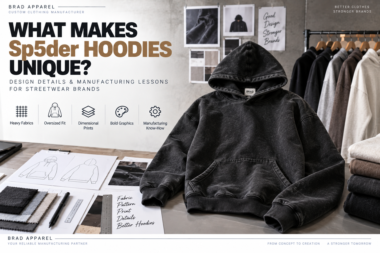
Sp5der hoodies stand out because several design elements work together at the same time.
It is not simply the spider-web graphics.
Across different official Sp5der releases, the brand has combined:
- Heavy fleece and French terry
- Oversized silhouettes
- Puff printing
- Discharge printing
- High-density graphics
- Web and star motifs
- Large front artwork
- Cropped proportions on selected styles
- Patches and appliqué
- Strong color combinations
The result is a hoodie that feels visually louder and more dimensional than a basic printed sweatshirt.
For clothing brands, the useful lesson is not to copy Sp5der's logos or artwork.
It is to understand how silhouette, fabric, print texture and graphic placement can work together to create a recognizable streetwear identity.
Independent design analysis: Brad Apparel is not affiliated with Sp5der. Brand names and product references in this article are used only to discuss publicly observable apparel design and manufacturing concepts.
What Makes a Sp5der Hoodie Look Different?
A standard hoodie often relies on:
Basic fleece + standard fit + flat logo print
A more expressive graphic streetwear hoodie may combine:
Heavy fabric + oversized proportions + dimensional print + large artwork + multiple graphic layers
That combination creates much stronger visual identity.
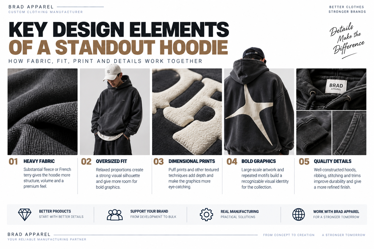
The main differences can be grouped into five areas:
| Design Element | What It Changes |
|---|---|
| Fabric Weight | Gives the garment more physical presence |
| Silhouette | Creates recognizable proportions |
| Print Texture | Adds depth instead of a flat graphic surface |
| Graphic Scale | Makes the artwork part of the garment architecture |
| Layered Details | Creates more visual complexity |
None of these elements is unique by itself.
The recognizable result comes from how they are combined.
1. Heavy Fabric Gives the Hoodie More Presence
One important feature across Sp5der's official product range is the use of substantial fleece and French terry constructions.
Official product descriptions include examples such as:
- 13 oz 100% cotton fleece
- 23 oz fleece
- 24 oz custom-milled French terry
Different releases use different fabrics and weights, so there is no single "Sp5der fabric specification."
The broader design lesson is more useful:
A heavier fabric changes how a graphic hoodie looks.
It can provide:
- More structure
- Fuller sleeves
- A more substantial hood
- Stronger visual volume
- A stable surface for large graphics
This is particularly important when the artwork itself is oversized.
A very lightweight fabric may collapse around a large print, while a more structured textile can help the garment hold its intended silhouette.
Fabric Weight Is Only One Part of the Result
Two heavyweight hoodies can still feel completely different.
Other factors include:
- Cotton quality
- Knit structure
- Brushing
- Washing
- Surface finish
- Shrinkage
- Fabric recovery
One official Sp5der product, for example, describes a custom-milled French terry that has been washed for a softer finished hand feel.
That illustrates an important manufacturing principle:
Fabric weight and fabric finishing should be evaluated together.
A high GSM alone does not automatically create a premium hoodie.
2. Oversized Proportions Change the Graphic Impact
Sp5der has also used oversized fits across parts of its product range.
This matters because graphics do not exist independently from the pattern.
A wider hoodie creates a different visual canvas.
For example, an oversized pattern may allow:
- Wider front graphics
- Larger web motifs
- More negative space around artwork
- Wider sleeves
- Larger hood proportions
The pattern therefore influences how the decoration is perceived.
Oversized Does Not Mean "Make Everything Bigger"
A good oversized hoodie still needs proportion.
Pattern development may adjust:
- Chest width
- Shoulder position
- Sleeve width
- Armhole depth
- Body length
- Hood volume
If every measurement is simply increased by the same percentage, the garment can become long rather than intentionally oversized.
For streetwear brands developing their own identity, the silhouette should be treated as a design feature rather than only a size choice.
You can learn more about this process through Brad Apparel's Pattern Development service.
3. Puff Printing Creates Physical Graphic Depth
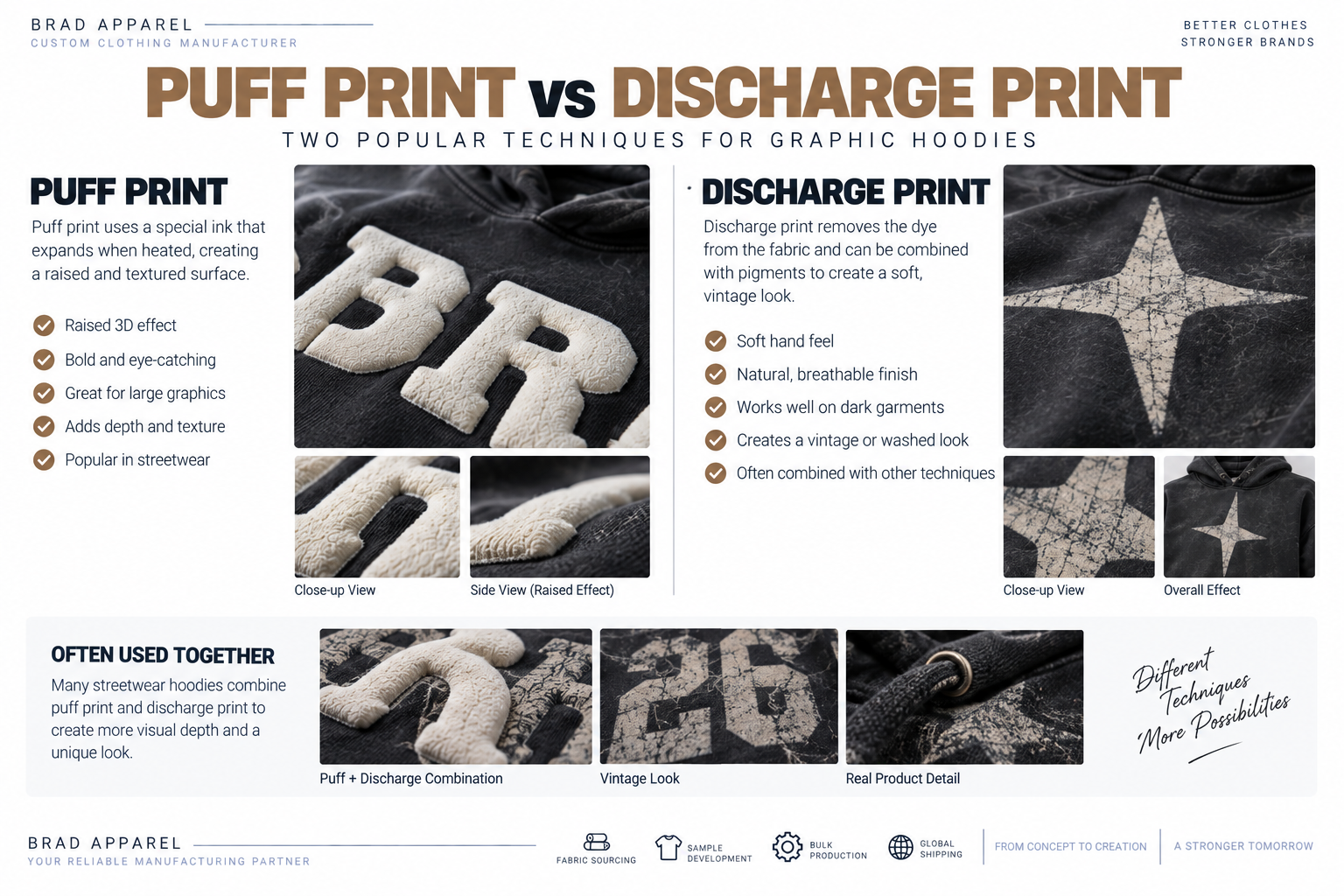
One of the most noticeable details on many Sp5der products is the use of raised print effects.
Several official product descriptions specifically mention:
Puff print
often combined with:
Discharge print
or other print techniques.
Puff printing contains an additive that expands during curing, creating a raised surface.
Instead of the graphic simply sitting flat on the garment, the print gains physical dimension.
This works particularly well for:
- Large typography
- Web-inspired graphics
- Thick outlines
- Bold symbols
- Streetwear logos
Why Puff Print Changes the Look So Much
A flat print mainly creates:
Color contrast
A puff print creates:
Color + shadow + texture + elevation
That additional dimension makes artwork more visible even when the garment and print use similar colors.
For example:
Black hoodie + black flat print
may appear subtle.
But:
Black hoodie + raised black puff print
can still create visible texture through light and shadow.
This gives designers another way to create graphics without relying only on bright color.
4. Discharge Printing Creates a Different Surface Effect
Discharge printing works differently from simply placing an opaque ink layer on top of cotton.
The process changes the color of the dyed fabric in the printed area and can then be combined with additional pigments or print layers.
The result can create:
- Softer-feeling graphics
- Vintage-looking surfaces
- Distressed visual effects
- High contrast on dark garments
Several official Sp5der products combine puff print and discharge print rather than relying on one technique alone.
That combination is important.
It shows how mixing print methods can create more visual complexity than simply adding more colors.
5. Layered Printing Creates a More Complex Graphic
A strong graphic hoodie does not always need one extremely complicated printing technique.
Sometimes the complexity comes from layering different effects.
For example:
Base discharge effect
+
Raised puff element
+
Small flat graphic details
can create much more visual depth than one large flat print.
For an independent clothing brand, this can be a useful approach.
Instead of copying another brand's artwork, develop an original graphic system using:
- Different heights
- Different textures
- Different opacities
- Different print finishes
Brad Apparel's Printing Techniques page covers options including screen print, puff print, digital printing and other surface effects.
6. Large Graphics Become Part of the Garment Architecture
Sp5der is strongly associated with large web-inspired graphics, oversized lettering and scattered motif systems.
From a manufacturing perspective, the interesting part is not the specific artwork.
It is the scale and placement.
A small chest logo can usually be placed almost independently from garment construction.
A large front graphic may interact with:
- Kangaroo pocket
- Center front
- Side seams
- Hood
- Sleeves
That makes decoration planning more complicated.
Large Graphics and the Kangaroo Pocket
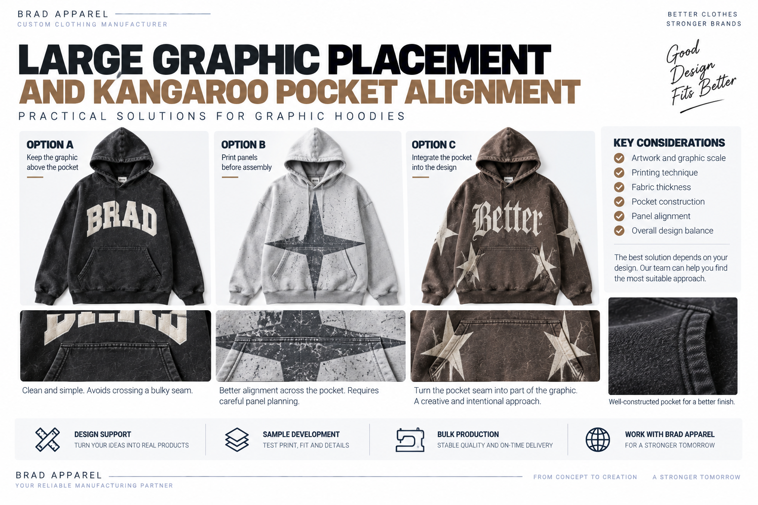
The kangaroo pocket creates one of the most difficult areas for large front graphics.
Imagine a design that continues from:
Main body → Pocket → Main body
If the panels are not planned correctly, the artwork may appear:
- Broken
- Shifted
- Uneven
- Distorted
There are several ways a factory may approach the problem depending on the design.
For example:
Option A — Keep the Artwork Above the Pocket
This is the simplest solution.
It avoids crossing a bulky seam.
Option B — Print Garment Panels Before Assembly
For certain designs, artwork can be applied to flat panels before the garment is fully sewn.
This provides better access to the printing surface.
Option C — Intentionally Break the Graphic
The graphic itself can be designed so the pocket seam becomes part of the visual layout.
This often works better than trying to make an extremely complex artwork appear perfectly continuous across thick construction seams.
The best choice depends on:
- Artwork
- Printing technique
- Fabric
- Pocket construction
7. Small Repeated Motifs Help Build Brand Language
Another useful characteristic of Sp5der's design system is repetition.
Official product pages show recurring elements such as:
- Web motifs
- Stars
- Large typography
- Numeric graphics
- Hood graphics
- Small scattered prints
The important branding lesson is that recognizable streetwear does not always depend on one logo.
A brand can build its own visual language by repeatedly using:
- A shape
- A symbol
- A type style
- A stitching detail
- A color combination
- A recurring placement
This creates consistency across a collection without making every garment identical.
8. Color Is Part of the Identity
Graphic streetwear often uses combinations that would feel aggressive on a more minimal garment.
Examples may include:
- Neon on charcoal
- Red on navy
- Pink on black
- Bright graphics on washed fabric
- Contrasting patch colors
Sp5der has used this type of high-contrast color language frequently.
For independent brands, the takeaway is:
Color should be planned together with print technique.
A bright flat print, a raised puff print and a washed pigment effect can all produce very different results even when using a similar color.
9. Cropped and Standard Hoodies Can Use the Same Design Language
Not every distinctive streetwear hoodie needs the same silhouette.
Sp5der has released both conventional hoodie proportions and cropped designs.
One official cropped hoodie combines:
- 23 oz fleece
- Puff print
- Discharge print
- High-density print
- Patch appliqué
This is a useful example of how the same brand language can move across different garment shapes.
For your own brand, you could similarly develop one graphic concept across:
- Oversized hoodie
- Cropped hoodie
- Crewneck
- Sweatpants
- T-shirt
The design language stays consistent while the products remain different.
10. Why Print Sampling Matters
One particularly useful detail appears directly on some official Sp5der product pages:
They warn that puff printing may crack or peel even with proper care.
That is important because it highlights a reality sometimes ignored in marketing:
Dimensional print effects have physical limitations.
The more raised and textured a print becomes, the more important it is to test:
- Expansion
- Flexibility
- Adhesion
- Wash performance
- Artwork detail
- Fabric compatibility
Always Test the Actual Fabric
A print strike-off should ideally be produced on the intended fabric.
Changing from:
320 GSM fleece
to:
450 GSM French terry
may change:
- Surface absorption
- Ink appearance
- Puff expansion
- Edge definition
The production fabric should therefore be confirmed before final bulk print approval.
11. Avoid Extremely Fine Details in Puff Artwork
Puff print expands during curing.
That means very small negative spaces and fine lines may close up.
Artwork intended for dimensional printing may need:
- Thicker lines
- More spacing
- Simplified details
The correct approach is to adapt the artwork to the process rather than forcing every digital detail into the final print.
12. Patches and Appliqué Add Another Layer
Some Sp5der products also incorporate racing-style patch appliqué.
Patches create a very different appearance from printing.
They can add:
- Textile texture
- Raised edges
- Contrast stitching
- Multiple materials
For an independent streetwear brand, combining one major print technique with a smaller patch detail can create stronger visual hierarchy than covering the entire garment with multiple competing effects.
13. What Streetwear Brands Can Learn From This Design Approach
The biggest lesson is not:
"Use a spider web."
It is:
Build several product details around one clear design language.
A strong custom hoodie might combine:
Silhouette
Oversized or cropped.
Fabric
Heavyweight cotton fleece or French terry.
Main Graphic
One large original visual.
Texture
Puff print or high-density print.
Secondary Detail
Small sleeve graphic, patch or embroidery.
Color
A deliberate contrast system.
When these details support each other, the hoodie becomes easier to recognize.
Example BOM for an Original Heavyweight Graphic Hoodie
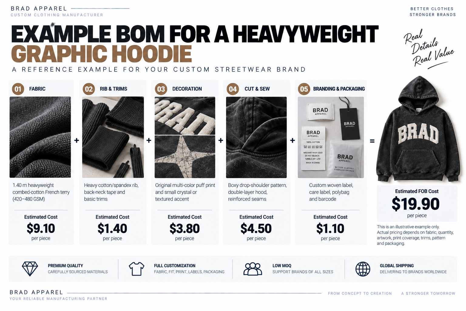
The following is an illustrative Brad Apparel development example for an original custom hoodie.
It is not a Sp5der cost estimate and does not represent Sp5der's internal manufacturing.
Raw Fabric
1.40 m heavyweight combed-cotton French terry
Reference cost:
$9.10
Rib & Trims
Example:
- Heavy cotton/spandex rib
- Back-neck tape
Reference cost:
$1.40
Original Decoration
Example combination:
- Large original multi-color puff print
- Small crystal or textured accent
Reference cost:
$3.80
Cut & Sew
Example:
- Boxy drop-shoulder pattern
- Double-layer hood
- Reinforced seams
Reference cost:
$4.50
Branding & Packaging
Example:
- Custom woven label
- Care label
- Polybag
- Barcode
Reference cost:
$1.10
Estimated Example FOB Cost
$19.90 per piece
Calculation:
$9.10 + $1.40 + $3.80 + $4.50 + $1.10 = $19.90
This is only an illustrative production scenario.
Actual pricing depends on:
- Fabric
- Quantity
- Artwork
- Print coverage
- Trims
- Pattern
- Packaging
Quality Control for Dimensional Graphic Hoodies
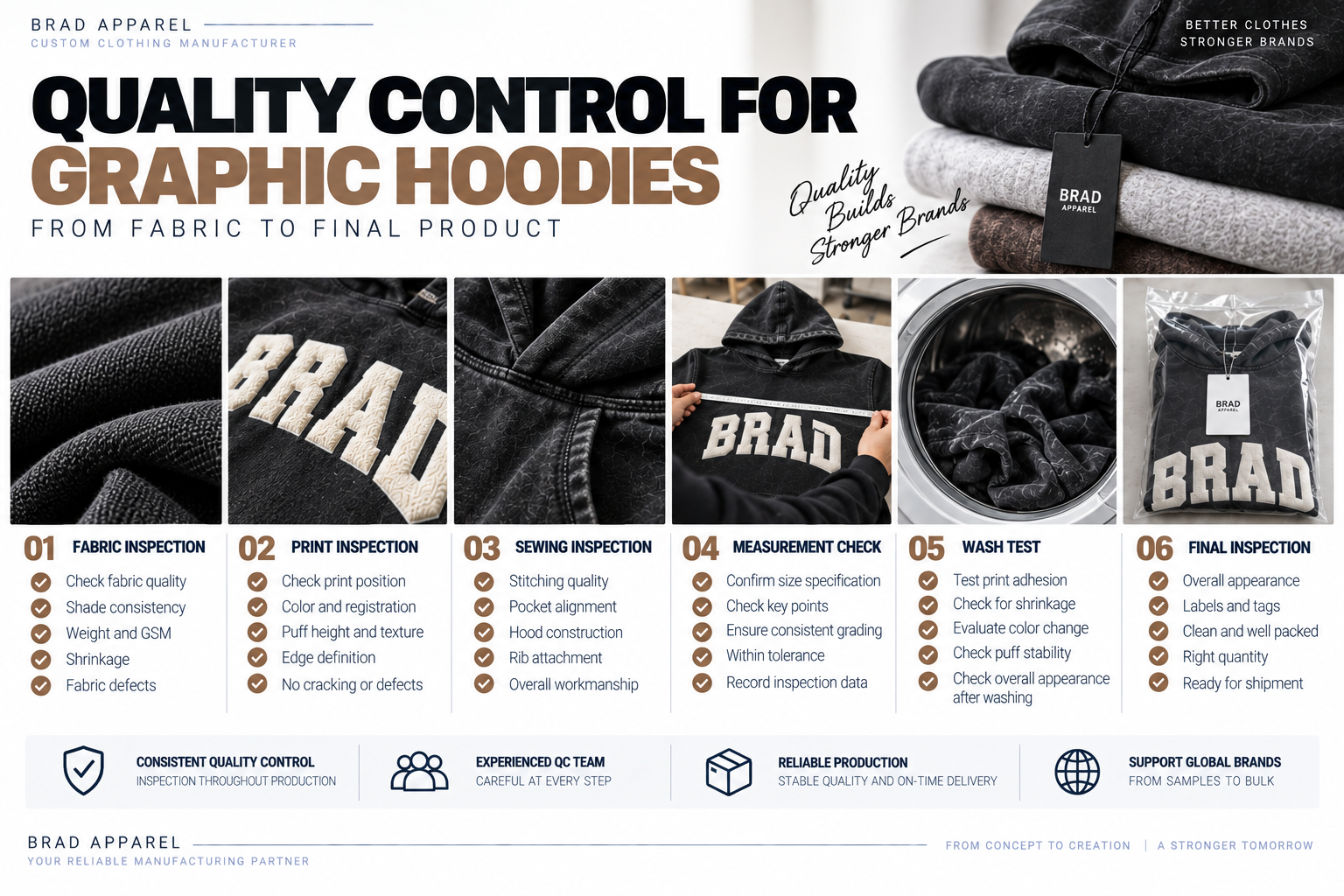
Graphic-heavy hoodies require inspection beyond normal garment measurements.
Important checkpoints include:
Fabric
Check:
- Shade
- Surface consistency
- Shrinkage
- Fabric defects
Check:
- Position
- Color
- Registration
- Puff height
- Edge definition
- Surface cracking
Sewing
Check:
- Pocket symmetry
- Hood shape
- Rib attachment
- Seam appearance
Wash Test
Evaluate:
- Print adhesion
- Puff stability
- Fabric shrinkage
- Color changes
Final Inspection
Confirm:
- Measurements
- Artwork quality
- Labels
- Packaging
- Overall appearance
For more complex designs, inspection should happen throughout production rather than only after the garments are completed.
How to Develop a Distinctive Hoodie Without Copying Another Brand
A reference brand can help communicate:
- Fit
- Weight
- Mood
- Decoration texture
But the final garment should develop its own visual identity.
Instead of asking:
"Can you copy this Sp5der hoodie?"
a better development brief might say:
"We want a heavyweight oversized streetwear hoodie with a raised print, a bold original front graphic and a washed finish."
Then define:
- Your own artwork
- Your own typography
- Your own symbols
- Your own color system
- Your own fit
This allows the factory to use the reference for technical direction without reproducing another brand's protected graphics or identity.
FAQ
What Makes Sp5der Hoodies Unique?
Their visual identity comes from the combination of substantial fabrics, oversized or fashion-focused proportions, large graphics, recurring web and star motifs, and dimensional printing techniques such as puff print.
Different releases use different specifications.
What Material Are Sp5der Hoodies Made From?
There is no single material specification across all releases.
Official product pages include examples using:
- 13 oz 100% cotton fleece
- 23 oz fleece
- 24 oz custom-milled French terry
Always check the specific product.
Are Sp5der Hoodies Heavyweight?
Many releases use substantial fleece or French terry constructions, but weight varies by product.
The official product specification is the best reference for a specific hoodie.
Does Sp5der Use Puff Printing?
Yes.
Multiple official products list puff print, including combinations with discharge printing and high-density printing.
Why Does Puff Print Look Different From Regular Screen Printing?
Puff ink expands during curing, creating a raised surface.
This adds:
- Texture
- Shadow
- Dimension
that a flat print does not have.
Can Puff Print Crack?
Yes.
Even Sp5der's own official product pages note that cracking or peeling can be possible on some puff-printed garments.
This is why sampling and wash testing are important.
Should a Brand Copy Sp5der Graphics?
No.
A brand can study:
- Fabric
- Fit
- Print texture
- Graphic scale
- Color strategy
while developing completely original artwork and brand identity.
Final Thoughts
Sp5der hoodies are distinctive because the design does not depend on one detail.
The effect comes from combining:
Fabric
Silhouette
Graphic scale
Print texture
Color
and
Repeated visual motifs
into one recognizable product language.
For an independent streetwear brand, that is the most useful lesson.
You do not need to reproduce another brand's artwork to create a hoodie with strong visual impact.
Instead, develop an original design system and then choose the fabric, pattern and decoration methods that support it.
Keep Reading